WORLD FLAG
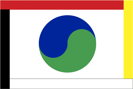
Globalization has been so fast and out of control that, in the end, no one thought of a global flag, an emblem for all of us, representing the planet as a whole. To be honest, a world flag already exists. It is called the One World Flag (pictured below). It was designed by David Bartholomew in 2006. In his blog, you read that “the One World Flag is an international symbol of diversity, Honoring the Talents, Abilities and Uniqueness in Each of Us, as Strengths that can Benefit All of Us” for whatever that means.
This flag is very inspiring, and perfect for a summer campsite but, in our humble opinion, it has got three little problems: first, being the output from a single person, and not from a congregation of people representing different countries, it is perhaps a bit solipsistic; second, it has been conceived as a free gift to the world, but then the project had to find a way to make a profit in order to finance its ideals. We have nothing against it, of course, we’d like to think it as free for everybody to use. Last but not least…the yin-yiang. What does that mean for an Aboriginal, an Inuit or a Maori? This is in fact a symbol based on a local culture which doesn’t represent everybody’s values. It’s revealing more of the creator’s beliefs than of a worldwide sentiment. Our considerations are limited, of course, to constructive criticism. Following emblems’ etiquette, we highly respect this flag as any other flag of the world.
Nevertheless, the Brandpowder Team, one year ago, started to focus on the subject with a more structured approach, trying to find a universal code that could work for everyone, independently from race, language, culture or religion. After sending a letter to several Governments and other worldwide organizations, asking their point of view (and getting no answer) we rolled up our sleeves. The first step for the worldwide flag project was to put together a worldwide team. Here below we list only those who signed their work, even if many others, due to political reasons, participated anonymously to the task. We wish to thank them all for their effort and sometimes colorful considerations on the subject. Their contribution and ideas have been priceless, and we all had a great time together.
In our office a considerable amount of data on existing flags has been collected. We went through the story of each flag, trying to work out which colors are more present, in order to get a proportion that could represent all Countries. We found out a lot had already been done on this topic. For sorting out color quantities and distribution, for instance, we found particularly helpful the crwflags database. Also wolfram‘s blog has been valuable for extra insight on color statistics, based on Mathematica software. We then shared all the collected information with every contributor to the World Flag project, letting everyone run wild with his or her proposals.
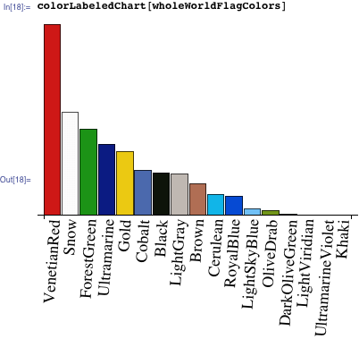
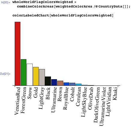
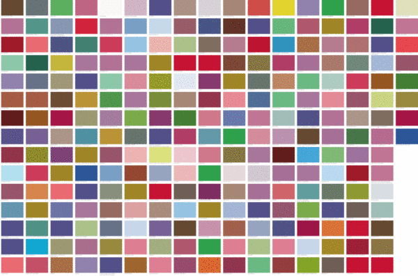
Below: the first chart shows worldwide color’s presence on a flag; the second shows what would it look like if flags were ranked according to population’s density. It’s evident, in this case, the impact of China.
Red has always been the favorite color, representing – also today – more than 30% of total flags’ surface. The rank has gone through minor changes in the past. One hundred years ago, for example, yellow gold was more popular than green, and light blue was more widespread than ultramarine. For our case study, we obviously concentrated only on contemporary flags.
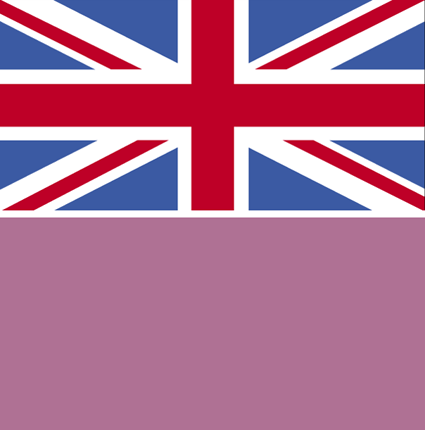
Above: we have been intrigued by an interesting essay by Diane Guyot, who created an algorythm to get the average color from each of the 248 world’s flags. Below: the Union Jack, as it would appear after her mathematical blender.
The challenge was to come out, in the end, with a flag that could represent, in the most accurate manner, the average values, taste and mood of 6 billion people. The first evidence of colors’ proportion on worldwide flags, and their meaning, is pictured here below:
It is worth to mention this interpretation is simply based on an average from all contributors’ point of view, with 39 different countries representing 85% of the total population. Red, the most popular of all colors, represents not only blood, of course, but also courage, love, aggressivity, heat and pride. Blue, likewise, bears with it several symbols: freedom, independence, democracy, aspirations, moral values, ideals and peace. White stands for spiritual values, pureness, neutrality, excellence and abstraction. Green is a symbol of land and hope, but it’s worth to consider that for some countries land is expressed by yellow or black. Black, in some cultures, is linked to roots, tradition and a sense of belonging. In others it is a warning to maintain a distance from borders. In our resarch we discovered that, if all flags of the world could be re-designed from scratch, blue would be the dominant color, followed by red, white and green.
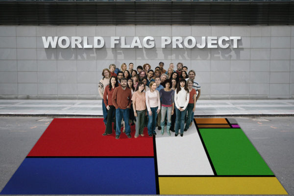
The World Flag, according to a set of agreements voted by all contributors, must not represent a symbol, a figure, an existent or familiar shape, neither had to bear a link to dogma, language, race or political statement. The Flag of the World, which we are happy to introduce here for the first time, is a 10-color emblem based on flags of the world’ color quantity. It represents the five continents plus the five main bodies of water. The black, as tenth color, and always in proportion to worldwide’s colors, is connecting together every field in a pathway which helps readability also in very small sizes. It was not easy to choose among hundreds proposals; in the end the top flag, voted by the vast majority of participants, won by a good length. The design is by a Chinese refugee who didn’t want to reveal his identity. The anonymity of the artist, he wrote us in letter accompanying his work, is the best prerequisite for a world’s creation. For whatever that means.
The World Flag is the result of a worldwide project that involved 39 countries. There is no copyright. Click on the flag to download it. It’s free and can be used for any purpose.
Above: The Brandpowder Team hoisted the World Flag in front of their office.




8 Comments
Join the discussion and tell us your opinion.
As an anthropologist and nationalist from Scotland, it was interesting to read what blue and white stood for and I have passed your comments onto our First Minister Alex Salmond who is campainging for an independent Scotland. Fantastic analysis and one of the best postings ever (if not forever) on flags, their meanings and a soulition for a shrinking world
Thank you Chris,
we are looking forward to have you here at our headquarters, to flag down some good whisky together.
Best Regards from all of us,
The Brandpowder World Team
Hi, David Bartholomew, originator of the One World Flag® here. Didn’t mind the piece, but feel I ought to correct some error in fact, and wish to make some comment on a bit of difference in approach that I consider worthy of note.
The One World Flag (1996, not 1995 as stated) was not conceived with profit in mind. It was non-profit for its first 12 years. That information is clearly stated on the website. To-date more has been donated in the name of the flag than has been received. I pulled it from its non-profit status as the admin fees to our fiscal agent were slowly eating me alive. My only shortcoming here is a lack of marketing savvy commensurate with any degree of creativity or vision one might assign to me. I will be eager for brandpower to throw its money where its mouth is in this respect. Much of the world has need for financial support of this nature.
The flag is in one sense a personal version of a vision, and in this regard is no different than any of the other images out there– all of which I support by way of links from the inspiration section of the links page at http://www.oneworldflag.org. Other than the words chosen to describe its origination it is no different from the intent of any to generate such a representation, and certainly no different than your “more structured approach, trying to find a universal code that could work for everyone, independently from race, language, culture or religion”. Just as no common world language such as Esperanto has yet taken hold, the jury still seems to be out on a common image as well. Not even Margaret Meade’s Flag of Earth has resonated universally; and so it seems there is still room for numerous images, and I don’t see where competition is needed or productive. Your rant, to me, speaks of the same ethnocentrism and solipsism of which I have been accused here, yet moreso, as I had no axe to grind by way of its introduction into the world or its track record of 16 years.
I say that this image “came through me”, and I do not see where this method of generation is any less worthy than groupthink. As it turns out I see that the 6 colors of the One World Flag are in the first 7 slots of your researched color label chart– perhaps testament to inspiration, intuition and heart meeting or exceeding results from a strictly left-brained perspective. A la the rings of the Olympic flag, I recognized very quickly that the One World Flag contains at least one color of the flags of every known country. The longer I sat with this image, what it was and could be, the more such insights kept layering themselves one upon another. I have found this to be true with a good number of the universal flag images which have come across my radar– the first of which was James Cadle’s Flag of Earth.
Speaking to the latter half of “shouldn’t a worldwide symbol be no-profit, instead, and free for everybody to use?” the image has been authorized for inclusion in a textbook (Multicultural Health, http://www.jblearning.com/catalog/9780763757427/), numerous school programs, design into the center of a new gymnasium floor of a school under construction, and basically any request in alignment with its mission and ideals… gratis. The only potential “profit” would come from any hat, shirt, flag, pin, etc., sold to any who would embrace the flag– no different than any U.S., or other flag that, to my knowledge, have not been offered for free in the world, as I imagine any brandpower flags that see the light of day would also not be given away in bulk; but if they are I’ll take 20,000.
As for the yin-yang symbol, and what it might mean to an “Aboriginal, an Inuit or a Maori”, I believe the balance of that iconic piece is pretty clear to all and not limited to Asia alone. And the fact that the colors for the four directions as generally acknowledged by numerous cultures is in there, has these mentioned cultures covered. I stand by the image as received, and its ability to speak on a number of levels to any who might contemplate it. With a minimum of description of what it represents, or none at all, the flag has gathered supporters in over 50 countries that I have been made aware of through direct correspondence. No idea of its possible reach beyond that. Here again, no data needed to strike a chord. And with the minimal marketing skills in my arsenal I found today that brandpower discovered this image on its own as well.
Finally, I would advise that there is an actual flag called the “World Flag” which has been out there for some time, and that the brandpower “World Flag Project” might require its own unique moniker (as well as a blessing from Piet Mondrian).
In summary– I don’t mind that this image was singled-out in what proved to be an interesting exercise. I do feel a degree of softening of the edges of the harshness of the “humble” critique and some fact-checking could have been implemented at-minimum; with the optimum possibility of rising to the level of heart, intention and actual impact of the One World Flag to-date an element of this exercise that could have been undertaken, over run-of-the-mill cleverness and smack.
In the end many people have been moved by the work which has yielded my offering. I hope that yours, mine and the expressions of all kinds, of all others, may ultimately upllift, with each taking accountability to add more positive into the world than negative. Think Bigger!
Hallo Mr. Bartholomew,
thank you for your kind reply and contribution to the topic. Brandpowder should pay more attention to what it writes before posting something that may sound offensive or disrespectful to the work and ideas of others. We are sorry if we hurted your feelings. The story you wrote about your flag throughout the years – which we are happy to publish – is inspiring and helps readers to have a more balanced point of view. We are with you when you say the world still lacks a real esperanto, a unity under shared “colors”, and our lively exchange is ironically revealing of men’s instinct to compete even over the most peaceful topic. We have corrected our article and we would be more than gald to hear again from you. We apologize and we send you a big hug!
Best Regards,
Monica Turlot
on behalf of the Brandpowder Team
Hi, You went a bit above and beyond, but I am pleased for the clearing of the air. No need to have amended your article. My feelings weren’t “hurted”. 🙂 Difference of opinion is “what makes a horserace”, as they say. It is more rare these days for us to account for our “stuff” and in this you proved yourselves honorable in my mind. Thanks for being a mensch (and whatever the plural of mensch is if there were more of you involved), and I too appreciate the lively discussion. I will come back here to experience more thought-provoking ideas. And if you truly carry forth with your flag I would invite you to add a link from within the links page of the One World Flag site, in the inspiration section, along with numerous other expressions of such an idea. Peace.
Hi David,
thank you from all of us. We’ll be keep in touch and let you know future undertakings. The best wishes to you and the One World Flag.
PS: May be we can draw togehter a flag for the solar system 🙂
Monica and the Team
You flag is nice, neutral and represent the values by its colors, but has to be explained before anyone understands what it mean. What do you think about those ones:
http://deathpwnie.deviantart.com/art/Earth-II-347438210
http://deathpwnie.deviantart.com/art/Earth-III-347438610
Great flags, Silvano.
We love the second one, most of all. It’s pretty cool, too. The only remark is that it’s quite similar to traditional horizontal-stripes flags.
This opens up to possible interpretations. Our world flag is not the result of a single concept, but a multiple, joint effort of people around the world.
Kind Regards,
The Brandpowder Team